Check out The Dieline.com's new facelift.
Lookin' good!
On another note - I grind my teeth at night. Who knew!?
9.30.2008
9.24.2008
This strikes my fancy!


I love Veeer . Being on their mailing list has ensured me many awesome things - from the graphic designer handbook to fun little puzzle books, and on and on. They have a lot of different merch that Iwantsobad, but this cordoroy messenger bag calls out to me. Pattttii, you know you wannnnt me.
Anyway - pretty awesome, this bag. It's called "fancy", because that's the name of the font that "fancy" is written in. Fun! And the inside pattern.. oh delicious!
You can read about it here but I think the pictures are likely enough - and really.. this post was probably pretty boring!
Sorry!
9.19.2008
Artistic Absinthe

Check out this gorgeous packaging! I'm in love with the way they have used the swirly botanical look - which is very trendy right now - without making it look too trendy. I think this will have a nice long shelf life because this is one of those times where the application suits the apothecary vibe perfectly. I love it.
This is quoted directly from the Dieline.com:
"Trillium Absinthe is one of the first legally produced absinthes in the United States. Its from Integrity Spirits in Portland Oregon and was designed by ID Branding, .......
"The bottle has a distinct shape that communicates the elegance and ritual of absinthe. The botanicals used to make the absinthe are represented on the outside of the bottle in the label design. The bottle itself, is sealed with a wax cap. The layers of the design echo the complexity of the absinthe within." -Jared Milam, Principal Designer - ID Branding"
9.18.2008
Miss you like crazy!

Because it seems that the most amazing people are too big for this town, a lot of my favourites have moved away, and I'm missing them all like crazy.
So here's to them, with a little letterpress card that can be found on Etsy HERE. Lalalalaletterpress!
Miss you guys!!!
ryanainsleykatietimmychristadadkristiaprillukejoanne EVERYONE
9.17.2008
Just my type...

I found an awesome resource for typographic inspiration! This flickr groupfeatures an avalanche of typography - which is all user submitted! Right up my alley. Oh man, do I wish I had time to summon my inner Marian Bantjes and get hand lettering. Maybe some other time. In the meantime.. fun fun fun!
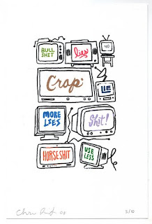
Chris Piascik is the wonderfully talented artist who did the work above. Nice job!
That's all for now!
9.12.2008
I pretty much can't handle...

How much I love this, and want it to be mine!
TastySuite at Esty has created this wall decal.
Loveeee it.
Designers are meant to be loved..
Harmonie Interieure out of France has these fabulous posters! This needed to be shared!

I wonder if they have a store. I should send my mom in to check it out. I neeeed this poster!

I wonder if they have a store. I should send my mom in to check it out. I neeeed this poster!
Duffy & Partners
Duffy & Partners is a new firm I've just heard about via Graphic-ExchanGE. I'm super impressed with this branding for Thymes. I also just found that they are responsible for that Knobb Creek bottle I love so much. I think there will be more of them to share later, but for now - hopefully this will be as good for you as it was for me!


9.09.2008
Why Knot?

I absolutely adore these sweet little rings from Uncommon Goods. They were made from a cast of a real piece of string! How cool is that!
I think that in true Samantha style - this is a ring that I want to purchase for myself - to remind me of all that I want to remember. PLUS - super pretty! Nothing wrong with that!
9.08.2008
Tasty, tasty!
Ryan and I had a lovely weekend earlier on (before the summer DIED! Oh wait .. it never really got here, did it? But that's another topic..) where we got to enjoy a friend's cottage in style.

This was purchased soley based off of it's appearance - as we'd never tried it or anything. It looks classic, yet modern - and it really appealed to Ryan! It was more money than JD - but he decided to try it anyway. The seal looks like wax but it's really some sort of rubber. I like the kraft paper and typography. Puuuuurday.

These babies have been catching my eyes for a while now - and not to be outdone by Ryan's fancy bottle - I decided I'd give 'em a whirl. They were not only yummy, but so beautiful! I had to get two of them because I liked both designs so much, and didn't want one flavour to feel left out. I love how fresh these look. Verrry nice!
Nothing's better than having a drink that doubles as an accessory!
Cheers!
Ryan and I spotted this beauty on the shelf. Packaging does work, people - because Ry is faithful to his Jack - even has a JD hat (two, actually) - but this puppy just couldn't be left on the shelf!

This was purchased soley based off of it's appearance - as we'd never tried it or anything. It looks classic, yet modern - and it really appealed to Ryan! It was more money than JD - but he decided to try it anyway. The seal looks like wax but it's really some sort of rubber. I like the kraft paper and typography. Puuuuurday.

These babies have been catching my eyes for a while now - and not to be outdone by Ryan's fancy bottle - I decided I'd give 'em a whirl. They were not only yummy, but so beautiful! I had to get two of them because I liked both designs so much, and didn't want one flavour to feel left out. I love how fresh these look. Verrry nice!
Nothing's better than having a drink that doubles as an accessory!
Cheers!
Labels:
alcohol,
booze,
design,
knobb creek,
kraft paper,
mojo,
packaging
9.05.2008
Packaging Delight!

I am in LOVE with the blog "the Dieline". It is a blog that features different packaging on a random basis. For me, winning the lottery is finding three updates in one day - as we all know, there is a lot of amazing packaging out there - but 365 days worth? Who knows?
This was featured on the dieline blog this week.
Copied directly from the blog: " Synergy V3 was recently designed by Moxie Sozo of Boulder, Colorado. In my opinion, it is a vast improvement".
My co-worker brought to my attention that it's a dietary supplement. The debate is whether it is a good thing to depart so far from the typical branding that the dietary supplements would have. Would this make it stand out on the shelf more, enticing people to buy? Or would it lack the identity to the point where people wouldn't see it as a recognizable dietary supplement?
So.. those are my thoughts. I just love the fruit pattern - I'm seeing more of this type of treatment - it reminds me of the ornate patterns India is so famous for - and I think it's beautiful!
Subscribe to:
Comments (Atom)


