4.27.2009

Beer?


As found on Lovely Package, this Pomegranate Wheat Beer from Toronto firm,Brand Tonic is a new (lovely) way of thinking when it comes to beer packaging!

Brand Tonic handled the whole identity - from logo to label, in the design of the whole line of beers - the most unique, of which, is this Pomegranate Wheat Beer. It has been treated in a non-traditional way, yet has an old-school vibe about it. At first, I thought, will anyone buy this? Your typical beer drinking hockey lover isn't usually exactly embracing of pretty things like this. But this beer is different, it has fruit flavour - so they're not appealing to that audience anyway, this would be for those who want a flirty drink in a beer. And this package is nothing, if not flirty!

Enjoy!

4.24.2009

Holy #@$#!


Hattomonkey, a firm in Russia, designed this packaging for Hot Sauce. They have a lot of REALLY awesome work (check out their blog!), I just wish I could read Russian!

Luckily for me, Lovely Package somehow got a translation, so here it is (which makes this package even better, in my opinion!)

"Hattomonkey has created a packaging design of hot sauce “Hashi” based on unique “non-censored” view. There is a huge selection of “Hashi” hot sauces: a very hot “Halapenio”, extremely hot “Habanero”, unbearable hot sauce “Cayenne pepper”, as well as wasabi and mustard. That special look #@$#! was created just as soon as we tried this hot sauce at the studio. It’s a comic stylized pack with logo consists of only symbols. So the exclamation balloon is to show an emotional wave. Designers have adopted a comic method. When it’s hard to express feelings through words they supplement text by pictures. Thereby the sauce pack content is reintroduced by shout balloon with jagged edges. Hattomonkey informal packaging design is hot and excited. This is not just a simple sauce on a store shelf, it shouts the same language you do “#@$#!”.”

I also just love the packages that they have chosen for their sauces - pretty great! Although I don't know how functional the peel-tops would be, I guess it depends on how you use it! AWESOME.

4.23.2009

Wry Baby

What is it about anything baby turning completely normal, rational, articulate and successful adults into cooing melty pods of goo - who say "cute" way more often than necessary (reminds me of that episode of Newlyweds where it follows Jessica and her mom shopping and they do that "cute" montage. Now every time I go shopping I am SO aware of how often I say cute! Ah! But I digress!)?

I, myself, hear my voice rise in hysterical tones when around the miniature! Especially clothes! But really, some of the clothes are so cutesy and ruffled, I feel like we're all 6 again, dressing up our dolls as cute as buttons. I want a cool kid. And could anything be cooler than these Mysterio Future-Predicting Tees from Wry Baby? Pretty awesome! And, having had my fortune read by Zoltar himself last weekend, I'm feeling like Mysterio's chances of predicting the future are very high!


Awesome, clever, funny, and teeny tiny. Wicked!

4.22.2009

From trees....


A relief print made from cross sections of actual TREES, Bryan Nash Gill is way awesome, and I want one! Except I would have no where to put it. But I do want one! How cool is this? Simple and neat? And what a story!

From your Monkey


I didn't get to my blog yesterday, but a very special RyGuy celebrated his 26th birthday yesterday, so HAPPY BIRTHDAY, BABE!

I can't take credit for this image, it was drawn by Rosalind Wilson, and it's pretty cute, I think!

Anyway - after a terrific weekend with Ryan in Niagara Falls, hitting Buffalo - now it's back to work! I took some pictures of pretty packaging that I felt was blog worthy, but we'll see how long it takes before I get the photos loaded off the camera!

Anywho - Happy Birthday RyGuy - someone was totally rockin' it when they designed you :) xo

4.16.2009

Hanker Chiefs


I got a chance to work with the wonderful Mike Erb again, and JUMPED at the opportunity! Here is the poster I designed for his Classic Country & Western band, The Hanker Chiefs using old posters for land in the states as inspiration. It was fun! I love working with Mike, it's always good times.

Creative flow = Happy Patti

Besides that, life's been hectic and busy! I've got to post a whack of posts, of all the fun things I've been seeing. As always, hop over to the dieline if you're looking for something to peruse!

Take care, chickens! Get out there and enjoy some sunshine!!!!!!

3.23.2009

My Curb


I got another opportunity to work with the talented Mike Erb again, working with him is always such a pleasure. He gave me, basically, free reign on the creative - which is ALWAYS a terrific chance to get those creative juices going - and so, this is my result.

It's really nice to do work like this, poster art has always been my favourite of all design (with packaging a very close second) especially the posters of the 60's and 70's - how much cooler can art be?
Super fun job, amazing client - one of those magical moments a designer dreams of! :)

3.13.2009

Great Sentiments!


Good to know that someone's putting that thought out there. See that someone's other work:
Mike Monteiro is that someone.

Hand rendered, no less! (gotta love that hand rendered typography!)

Happy Friday the 13th, ladies and gents! Hope your weekend is inspiring!

3.12.2009

Grrrrrrrrrrrrrrrrrreat


Today is one of those days. Sometimes it feels like for every step forward that you take, you end up taking 3 steps backwards. In this time of messed up economies and the drizzle of dread that has been surrounding 2009 so far, I suppose I'm not alone in feeling this way!

I love deviantART. It's a great source for inspiration, and to see what people are doing! There is a LOT of talent at deviantART, and most of the people are doing it just for the sheer satisfaction of creation. That's the best kind. So, I stumbled upon the photo above when I searched "anger" at deviantArt, because, I was angry. And then I came across the beautiful gallery of Protogeny, the one that took the above photo. That made me feel better, at least a little.

So here I go, heading off for my afternoon nap. Hopefully this year will start to turn around for everyone! In the meantime, why don't you take a stroll to deviantART and let me know what YOUR favourite galleries are!
P.

3.11.2009

That Thom, Thom, Thom, Thom, Thom!

I was thinking - if there is a weekday that is awesome, even though it's a work day, and not including Friday, because that's the weekend - well, it would be Wednesday. It's kind of like a little pet that is, you know, something to be looked after and everything, but is boundless with positive vibes and wonderful things to experience. Wednesday is totally the best pet of the workdays. Yep.


Thom Yorke. Not the most handsome devil in the world, but talent which exceeds that of a 'normal' being. Radiohead's awesome, and Thom is, too!
For the Grammy's this year TWBA \ Chiat \ Day created this beautiful poster, as well as some others. Beautiful, inspiring, creative.. just like the music of Thom and Radiohead, alike!

Hope you enjoy it - Happy Hump Day!

3.09.2009

I'm Back?


The good people at The Dieline piqued my interest, once again - sharing with me, the world of Aesthetic Apparatus!. They created these tea canisters for Andrews & Dunham's Damn Fine Tea.
Quirky, fun and unique, Aesteic Apparatus' portfolio is a kaleidoscope of colour and fonts - check out this poster for The Talkies.


I know it's been a long while since I posted - and I'm going to work on that. Who wants to read a defunct and never posted on blog? Like no one in the world. I think, also, that since my life is so freaking hilarious - I may begin sharing some of my antics with you - I think you'll laugh!

Have a super day!

1.13.2009

I love hand rendered typography


Today was one of those days where the filesizes I've been dealing with are massive - so I took some time while watching that blue progress bar, slowly torture me by creeping to the right at a snail's pace - to doodle. And that's something I love to do, but don't get to do very often.

So there yo go, folks - shot with my new phone - not great lighting, not great colour, not great resolution - thought I'd share what I've been up to!

Do you love hand rendered typography?

1.08.2009

The real McCoy!


I just about flipped my lid when I saw this bourbon packaging by The Creative Method. This blog is turning quickly into a packaging fan site - what can I say - I like packaging tons and tons and tons!
And here is a gorgeous example of packaging that really works - and really creates a character for a product. The typesetting is great - current, but with some nostalgic air - especially in the distressed treatment. The wood box is great, simple, but effective. I really like the added touch of the die for the label, those rough edges really make it look like it's travelled through time. All together, it sums up (to me) a bourbon that is tried, tested and true - and a real treasure.

Love!

On a side note - I've fallen in love with the blog Petunia Faced Girl. You really should pop over and take a look. Maybe I've already tried to send you over, I don't know - but it's worth checking out FO SHO!

Also - my firm has finally gotten around to writing a bio about me for the website. When it's up, I'll have to post it. I know that my boss HAS to write good things about me because, really - we're selling ourselves, right? But it puts a smile on my face either way!

Peace out!

1.07.2009

Breath of fresh air

After a break from posting, due to the absolute MAYHEM that is Christmas, I bring you:


I am loving patterns right now. And I am loving the rich look of these Stussy air fresheners.
I always remember Stussy as being more of a fashion line - but who knows! I like how the packaging is like that of spray paint. I think that's neat. The design itself takes it to a whole new place, it's somehow old fashioned looking - with an urban edge.
Thoughts?

Thanks to High Snobiety for finding this first!

Also - over Christmas, I was so lucky to receive the "Designers are meant to be love not to be understood" poster that I blogged about here. I think I'm going to Plakkit - it's headed for the studio.
Thanks mom & Denis - hope your flight back to France today is quick and painless!

12.16.2008

Papercuts


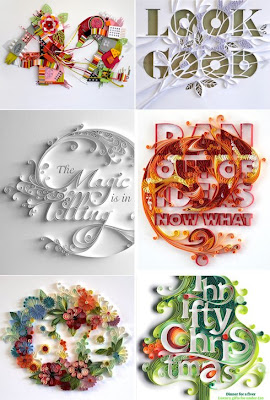
Yulia Brodskaya, from Russia, has created these beautiful paper illustrations. We did some paper folding and cutting projects in first year (college - design) but it certainly didn't get to this level. I love her work, it's beautiful - and showcases wonderfully how amazing paper can be as a medium. It makes me want to bust out my french curve and assorted exactos, rubber cement and cutting mat and start experimenting again. The delicate way she handles the sculptures is nearly impossible.. and no other effect can come close to mimicking the look of these beautiful pieces.

Also - I realize it's been ten thousand years since I last posted. Christmas crazyness has forced itself upon me. I love Christmas like crazy, but man, am I ever a ball of nerves when it's on its way! I have countless hours of shopping still to do - and all the while doing the Christmas obligatory parties, etc., trying to fit in friends, phone calls and sleep - not to mention Ryan!

I have noticed that there is a LOT of really awesome packaging out there this Christmas.. to the point where you don't even want to wrap some of them (in fact, we're not going to). And recycled material is big in a lot of the packaging - LUSH cosmetics and bath products, for example, use recycled paper and boxes for all their bath supplies. It's pretty cool! Anyway - I'm in the market for a new cellphone - hopefully with a crappy webcam - so then I can take shots of the pretty things I see - which will remind me to post them, or at least remember them for myself!

Anywho - hope your Christmas is awesome and Merry. Take a break for a cuppa tea - it helps me sooth my frazzled nerves! Like a hug from the inside!